
Textile Color Trends 2026 for Apparel & Accessories: Which Trending Colors Can You Actually Produce on Your Trims?
Textile color trends 2026 are already shaping collection planning across every segment of the apparel industry. But here's the problem most brands discover too late: a gorgeous trend palette on a mood board doesn't guarantee that same color can be reproduced on a 12mm woven label, an embroidered patch, or a PVC zipper pull. The agitation is real — rework, missed launch windows, and inconsistent trims across your BOM. The solution starts with understanding which 2026 colors are production-ready for your specific trims and accessories.
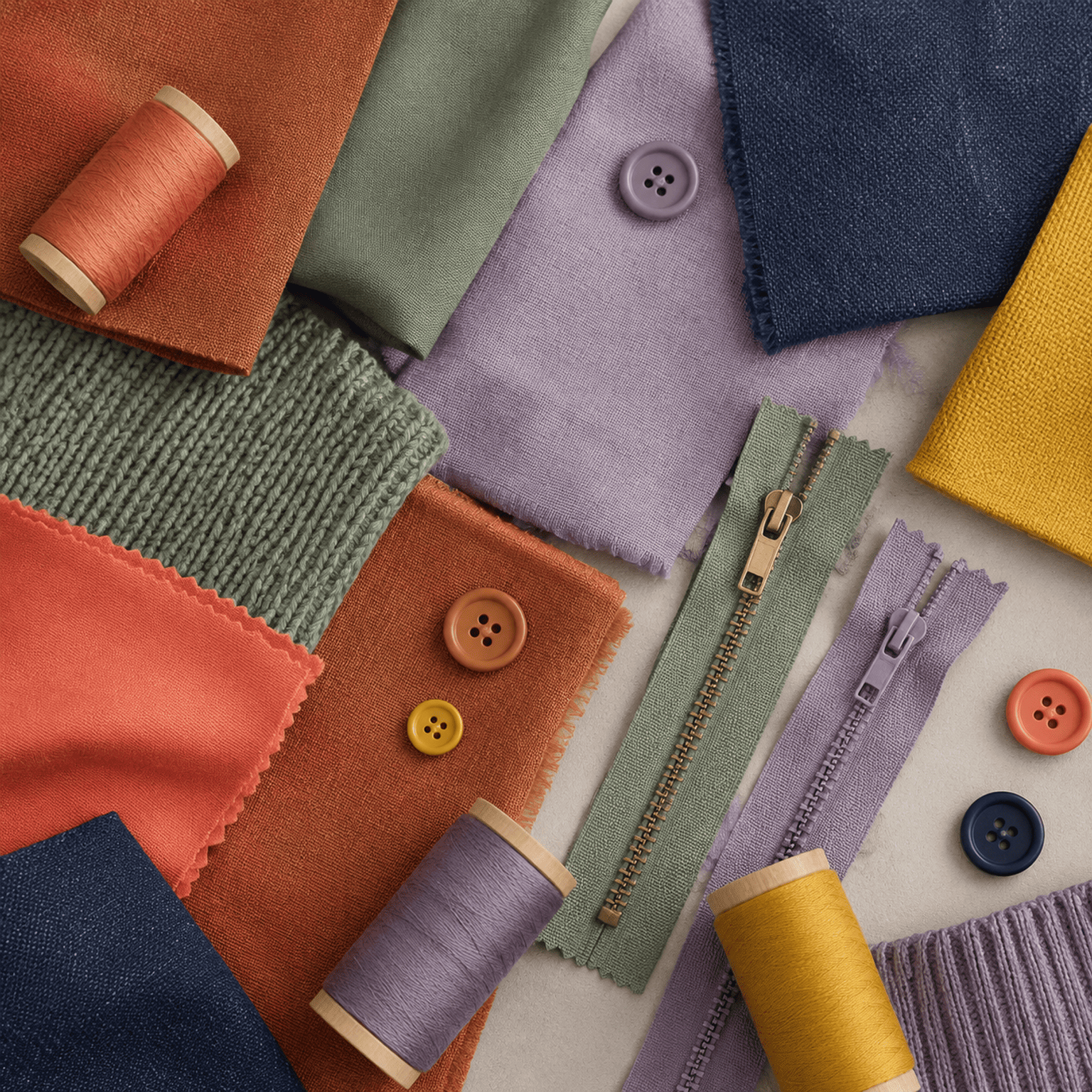
The headline textile color trends for 2026 — from butter yellows and oxidized earth tones to digital lavender and deep teal — promise rich, mood-driven palettes. However, the real question for procurement and brand managers is not "which colors are trending" but "which trending colors can I safely specify across all my trims without delays, color mismatches, or surprise costs." The answer depends on your substrate, your timeline, and your supplier's dye-lot capability.
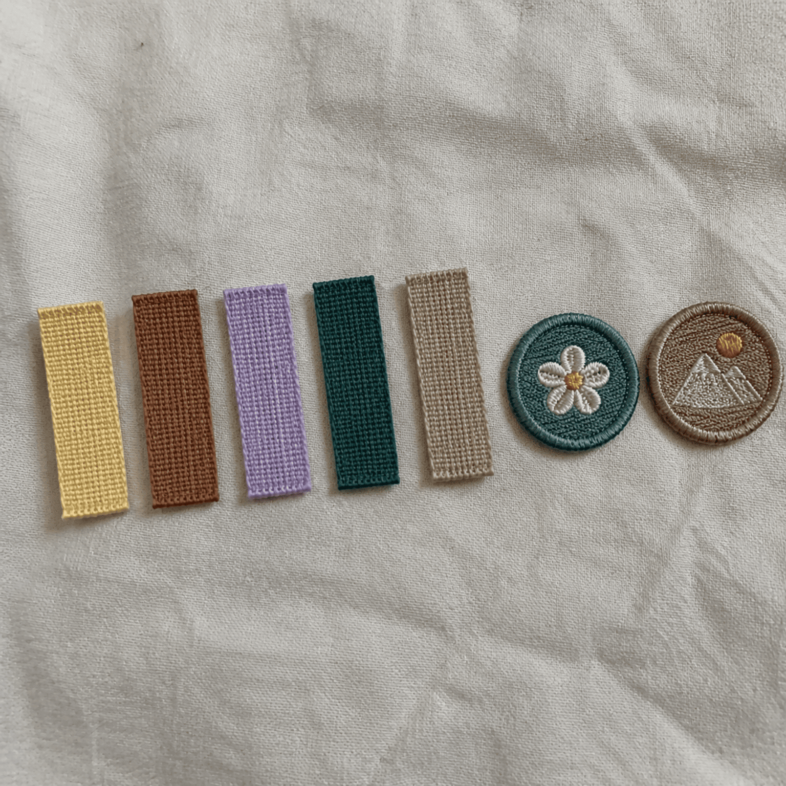
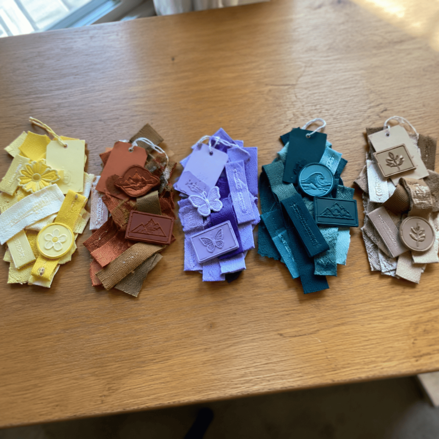
What follows is not another color-trend listicle. Instead, I'm mapping the major 2026 color families against the trims we manufacture every day — woven labels, embroidered patches, elastic bands, PVC patches, hang tags, and more — and flagging exactly where execution risk is high, where it's manageable, and where you need to start sampling now. Let's get into it.
What Are the Key Textile Color Trends for 2026?
Every season, brands scramble to decode the latest Pantone and WGSN forecasts. The problem is that most summaries stop at "here are the colors." That leaves procurement managers holding a Pantone chip with no idea whether their trim supplier can match it.
The key textile color trends for 2026 cluster around five major families: butter yellows, oxidized earth tones, digital lavender, deep teal, and warm neutrals (mocha to sand). These palettes reflect broader cultural shifts toward nature-inspired warmth, tech-influenced pastels, and quiet luxury1. Pantone's ongoing emphasis on complex mid-tones and WGSN's focus on "emotional color"2 mean that 2026 leans heavily into colors that are subtle, layered, and — from a production standpoint — notoriously difficult to reproduce consistently.
Butter Yellows
Pantone and WGSN both signal soft, warm yellows as a breakout story for 2026. Think muted gold, aged butter, and pale saffron. These are not the saturated neon yellows of previous cycles. They sit in a mid-tone range that requires precise dye control.
- On woven labels: Achievable, but narrow-width labels (under 15mm) can lose the warmth of a butter yellow because there's less surface area for the eye to read the color. Yarns in this family tend to shift slightly cooler under fluorescent retail lighting.
- On embroidered patches: Generally feasible. Embroidery thread suppliers like Madeira and Isacord carry close matches3. However, stitch density affects perceived color. A loosely stitched butter yellow on a dark twill backing will read muddier than the Pantone chip.
- On elastic bands: Risky. Elastic dyeing involves stretch-state color shift — the color looks different relaxed versus stretched4. A butter yellow elastic can appear washed out when tensioned on a waistband.
- On PVC/rubber patches: Feasible with standard PVC color mixing. PVC handles muted yellows well because the color is compounded directly into the material, not dyed.
- On hang tags: Low risk. Paper and coated card stock reproduce butter yellows reliably via offset or digital printing.
Execution verdict: Butter yellows are broadly feasible across most trims, but require early sampling on elastic and narrow woven labels to confirm visual warmth.
Oxidized Earth Tones
Rust, terracotta, dried clay, and burnt sienna define this family. These are warm, reddish-brown mid-tones inspired by natural oxidation and desert landscapes. WGSN positions them as a continuation of the "craft and nature" macro trend.
- On woven labels: Good reproducibility. Woven label yarns in the brown-red spectrum are well-established. The risk is batch variation — earth tones involve complex dye recipes, and a slight shift toward orange or plum can change the entire mood.
- On embroidered patches: Strong performance. These colors have high thread availability and read well at typical patch stitch densities.
- On elastic bands: Moderate risk. Similar to butter yellows, the stretch-state shift applies, but earth tones are more forgiving because they're darker.
- On PVC/rubber patches: Excellent. PVC compounds handle earth tones with high consistency.
- On hang tags: Low risk, though uncoated paper stocks can absorb ink unevenly, shifting the tone.
Execution verdict: Oxidized earth tones are among the safest 2026 trend colors for trims, with the main risk being batch-to-batch consistency on woven label yarns.
Digital Lavender
Continuing its momentum from 2023–2025, digital lavender evolves into a slightly cooler, more silvered version for 20265. This is one of the most challenging trend colors for trim production.
| Trim Type | Feasibility | Key Risk |
|---|---|---|
| Woven labels | Moderate | Yarn availability in precise lavender tones is limited; custom dyeing required |
| Embroidered patches | Moderate | Thread color matching is close but stitch texture can shift perceived hue |
| Elastic bands | High risk | Lavender shifts toward gray or pink under tension and after washing |
| PVC/rubber patches | Feasible | Color compounding achieves good results, but matte vs. gloss finish changes perception |
| Hang tags | Low risk | Print reproduction is reliable on coated stocks |
In our production, we've seen multiple clients send us a Pantone lavender chip and assume it's a straightforward match. It rarely is. Woven label yarns in the purple family are the thinnest part of most suppliers' standard inventory. That means custom yarn dyeing, which adds 7–14 days to your lead time and increases minimum order requirements. If your order volume is low, the per-unit cost of a custom-dyed lavender label can be 20–30% higher than a standard colorway.
Execution verdict: Digital lavender is high effort, high risk on soft trims (labels, elastic). Plan for custom dyeing lead time and request wash-fastness testing before committing.
Deep Teal
Rich, saturated teal — blending blue and green with depth — is a standout for 2026 across both menswear and womenswear. The good news: saturated colors are generally easier to control than muted mid-tones.
- On woven labels: Good results. Teal yarns are available in standard ranges, and the saturated nature of the color reads clearly even on narrow-width labels.
- On embroidered patches: Excellent. High stitch density in deep teal creates a rich, jewel-like surface.
- On elastic bands: Moderate. Dark colors on elastic show less stretch-state shift, but teal can trend toward navy under certain lighting conditions.
- On PVC/rubber patches: Excellent. Deep teal compounds are stable and visually striking.
- On hang tags: Low risk with proper ink calibration.
Execution verdict: Deep teal is one of the most production-friendly 2026 trend colors for trims. Early sampling is still recommended, but feasibility is high across substrates.
Warm Neutrals (Mocha to Sand)
Quiet luxury continues to drive demand for sophisticated neutrals. The 2026 palette emphasizes warmer versions — mocha, caramel, oat, and warm sand — over the cool grays and beiges of previous years.
This family is deceptive. Warm neutrals look easy. They are not. A mocha tone that works beautifully in a womenswear knit may appear visually flat and lifeless on a 1cm-wide woven label. The reason: on a small surface area with a woven texture, subtle warmth disappears. The label reads as generic brown.
- On woven labels: Risky for very narrow widths. Wider labels (20mm+) reproduce warm neutrals more faithfully.
- On embroidered patches: Moderate. Stitch texture adds dimensionality, which can actually help warm neutrals look richer than they do on flat substrates.
- On elastic bands: Moderate risk. Warm neutrals on elastic tend to read cooler and flatter after repeated stretching and washing.
- On PVC/rubber patches: Feasible but requires careful finish selection. A matte-finish mocha PVC patch looks premium; a glossy one can look cheap.
- On hang tags: Low risk. Paper printing handles warm neutrals well, especially on uncoated or kraft stocks.
Execution verdict: Warm neutrals are visually rewarding but technically tricky on narrow or small-area trims. Always request physical strike-offs, not just digital mockups.
Why Does Trend Color ≠ Production-Ready Color on Trims?
Brands routinely treat a Pantone trend forecast as a standard dye-lot reference. This is one of the most expensive misunderstandings in trim procurement. Why does a trend color fail to translate directly to a production-ready trim color?
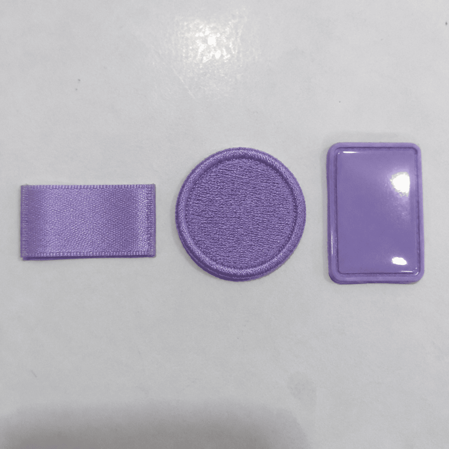
A Pantone trend color is a design inspiration tool, not a manufacturing specification. Each trim substrate — woven yarn, embroidery thread, elastic webbing, PVC compound, printed card stock — has a different color gamut, different dye chemistry, and different fastness constraints. A single Pantone reference can look noticeably different across five trim types in the same order.
The Substrate Problem
Here's what happens at the factory level. A client sends a Pantone TPX chip — say, Pantone 17-3938 (a digital lavender variant) — and requests that all trims match it. The woven label team pulls their closest yarn. The embroidery team matches their closest thread. The PVC team mixes their compound. Each comes back slightly different because:
- Yarn fiber content affects dye uptake. Polyester woven label yarn absorbs dye differently than cotton embroidery thread6.
- Surface texture changes perceived color. A satin-weave label reflects light differently than a twill-weave patch backing.
- Material opacity varies. PVC is opaque and solid; woven yarn has translucency at the fiber level.
- Finishing processes shift color. Heat-cutting a woven label edge can slightly darken the border yarn7. Washing an elastic band can shift its hue by half a shade.
In our production, we've handled cases where a client approved a screen proof digitally, received physical samples that looked "off," and then blamed the factory — when in reality, the color was as close as that substrate could get. The lesson: always evaluate trim color on the actual substrate, at the actual size, under the actual lighting conditions of your retail environment.
Fastness Constraints
Color fastness (resistance to fading from washing, light, and rubbing) varies by trim type and dye class. Trend colors that rely on complex dye blends — exactly the kind of subtle, layered tones dominating 2026 — are more susceptible to fastness failure. A gorgeous oxidized terracotta on a woven label can shift to a muddy pink after five washes if the dye recipe isn't formulated for durability.
| Fastness Type | Woven Labels | Embroidered Patches | Elastic Bands | PVC Patches |
|---|---|---|---|---|
| Wash fastness | Moderate–High | High | Moderate | Very High |
| Light fastness | Moderate | Moderate | Low–Moderate | High |
| Rub fastness | High | Moderate | Low | Very High |
Key takeaway for 2026 planning: If your collection features muted pastels (butter yellows, digital lavender) or complex mid-tones (mocha, oxidized earth), request fastness test reports for your specific trim substrate before approving color. Don't assume a standard Pantone match includes fastness validation — it doesn't.
How Do You Manage Batch Consistency for Trend Colors on Trims?
You've found a perfect 2026 trend color. Your first sample looks beautiful. Then the production run arrives and it's half a shade off. This scenario — batch inconsistency — is the hidden cost that nobody talks about in trend forecasting articles.
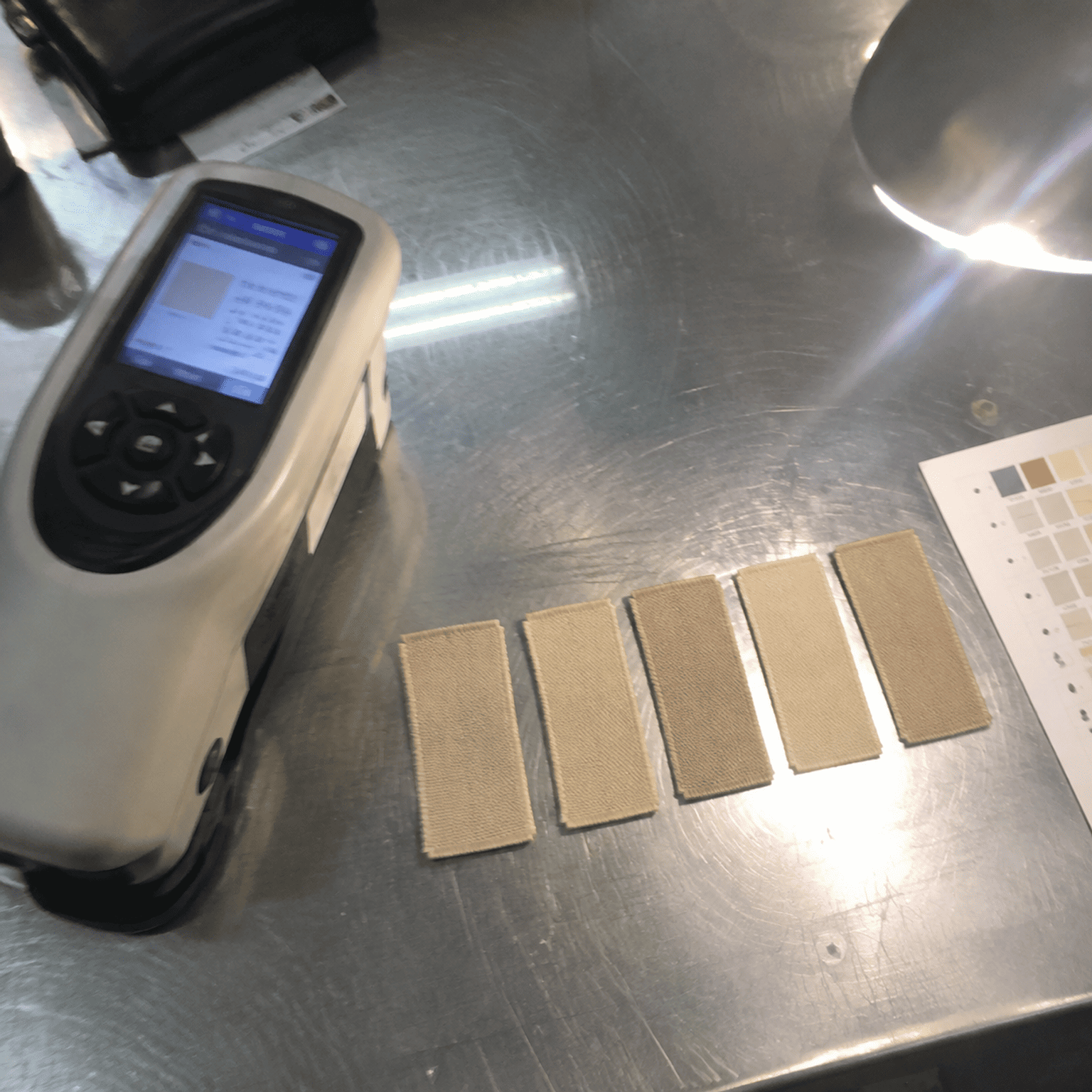
Batch consistency for trim colors depends on dye-lot control, substrate uniformity, and agreed tolerance ranges. Complex mid-tones and muted pastels — the signature of 2026's textile color trends — are inherently harder to reproduce across production runs. Establishing a clear ΔE tolerance (typically ΔE ≤ 1.5 for critical trims) with your supplier before production is the single most important step you can take.
What Is ΔE and Why Should You Care?
ΔE (Delta E) is the standard metric for measuring perceived color difference8. A ΔE of 1.0 is approximately the threshold of what the average human eye can detect. For garment trims:
- ΔE ≤ 1.0: Virtually imperceptible difference. Ideal but expensive to maintain across all batches.
- ΔE 1.0–1.5: Slight difference detectable under controlled lighting. Acceptable for most branded trims.
- ΔE 1.5–3.0: Noticeable difference. Risky for trims that sit next to each other (e.g., a woven label next to an embroidered patch in the same colorway).
- ΔE > 3.0: Obvious mismatch. Unacceptable for any branded application.
Why 2026 Colors Make Batch Control Harder
Saturated, pure colors (a true red, a deep navy) involve simpler dye recipes with fewer components. A butter yellow or a mocha, by contrast, might require blending three or four dye components in precise ratios. Each component has its own batch variability. The compounding of small variations across multiple dye components creates larger aggregate shifts.
I've seen this play out repeatedly in our production. A client orders 10,000 woven neck labels in a warm sand tone. The first 5,000 look perfect. The second 5,000 — produced two weeks later with a new dye lot of one component yarn — shift slightly cooler. Both batches are within a ΔE of 2.0, which is technically within most industry tolerances. But when the labels are sewn into garments side by side on a retail rack, the difference is visible. That's the kind of issue that causes returns and brand-perception damage.
Practical Steps to Control Batch Consistency
- Specify ΔE tolerance in your purchase order. Don't leave it to the supplier's default.
- Order all trim colors from a single dye lot when possible. If your total quantity fits within one production run, insist on single-lot production.
- For large orders spanning multiple dye lots, request a production-approved swatch (PAS) for each lot before sewing.
- Keep a physical reference swatch on file — both at your office and at the trim factory — and require all batches to be checked against it under D65 lighting9.
- Avoid splitting a single-color trim order across multiple suppliers. Two factories will never match each other as closely as two runs from the same factory.
When Should You Lock Trim Colors Relative to Fabric Sourcing?
Here's a timing problem that catches brands every season: trim orders are placed after fabric is locked. By the time a procurement manager wants woven labels to match a trend color they saw six months ago, the lead time for custom-dyed trim yarn may push delivery past their production deadline.
For 2026 collections, you should begin requesting trim color samples at least 12–16 weeks before your garment production start date. Custom-dyed trim yarns require 3–4 weeks for dyeing alone, plus 1–2 weeks for sampling and approval, plus your standard trim production lead time. If you wait until fabric is cut to specify trim colors, you've already lost the window for any custom colorway.
A Practical Collection Development Timeline
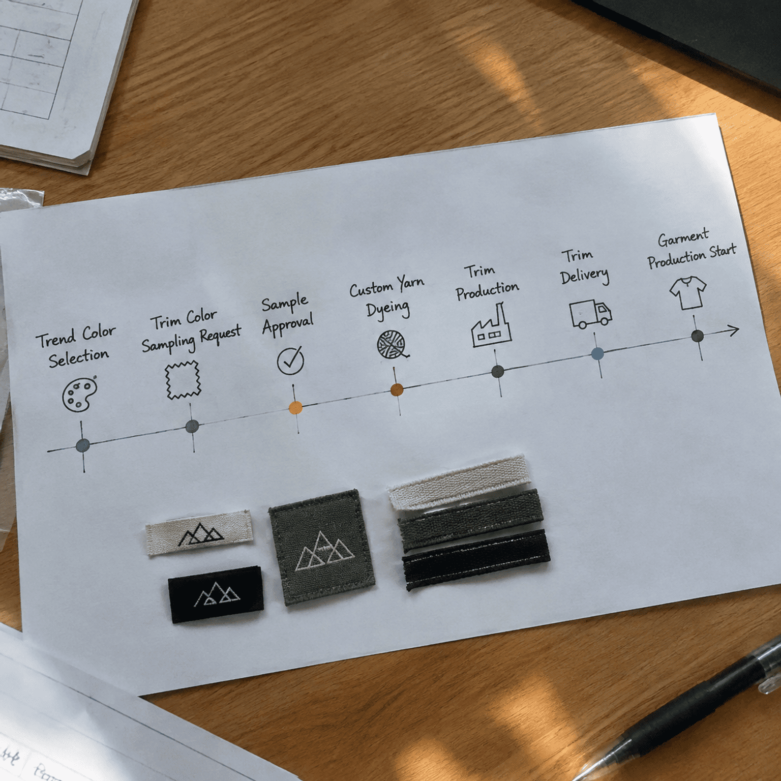
Here's the timeline I recommend to clients planning 2026 collections, based on what we see work in practice:
| Milestone | Timing (Weeks Before Garment Production) | Action |
|---|---|---|
| Trend color selection | 20–24 weeks | Identify 2026 palette. Cross-reference with trim feasibility. |
| Trim color sampling request | 16–20 weeks | Send Pantone references to trim supplier. Request physical strike-offs on each substrate. |
| Sample approval | 12–16 weeks | Evaluate physical samples under retail lighting. Approve or request adjustments. |
| Custom yarn/thread dyeing (if needed) | 10–14 weeks | Supplier dyes custom trim yarn or thread to approved standard. |
| Trim production | 6–10 weeks | Full production run against approved PAS. |
| Trim delivery | 4–6 weeks | Trims arrive at garment factory, ready for assembly. |
| Garment production start | Week 0 | All trims in hand. No delays. |
What Happens When You Don't Plan Ahead
We've seen multiple clients come to us 4–6 weeks before their garment production start date requesting a custom digital lavender woven label. At that point, the options are:
- Compromise on color: Accept the closest available stock yarn color. It won't be a perfect match, but it ships on time.
- Pay a rush premium: Custom yarn dyeing can sometimes be expedited for a 30–50% surcharge, but quality control suffers under time pressure.
- Miss the season: Insist on perfect color matching and accept that trims will arrive 2–3 weeks late, potentially pushing your entire production schedule.
None of these outcomes is good. The fix is simple: start trim color planning at the same time you start fabric color planning, not after.
Which 2026 Trend Colors Should You Prioritize for Your Trims?
With limited sampling budgets and tight timelines, you can't chase every 2026 trend color across every trim type. So which ones should you prioritize?
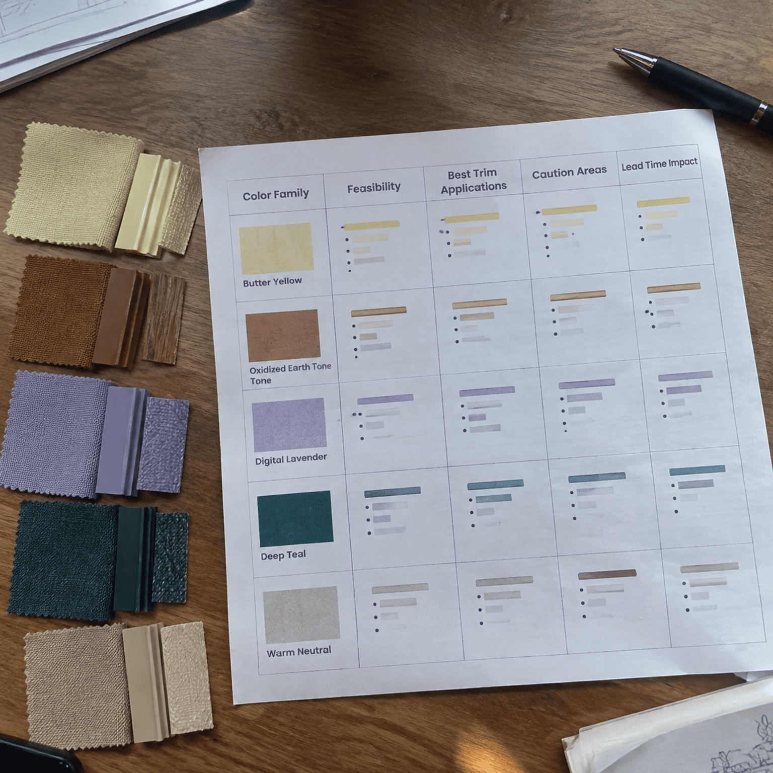
Prioritize 2026 textile color trends that offer the best combination of visual impact, production feasibility, and cross-substrate consistency. Deep teal and oxidized earth tones are the strongest candidates for full-BOM adoption. Butter yellows and warm neutrals require selective application. Digital lavender should be reserved for trims where you can absorb custom-dye lead times and costs.
Decision Matrix
| Color Family | Overall Feasibility | Best Trim Applications | Caution Areas | Lead Time Impact |
|---|---|---|---|---|
| Butter yellows | Moderate | Hang tags, PVC patches, wider woven labels | Elastic bands, narrow labels | Standard (+1 week for sampling) |
| Oxidized earth tones | High | All trim types | Batch consistency on woven labels | Standard |
| Digital lavender | Low–Moderate | PVC patches, hang tags | Woven labels, elastic bands | +2–4 weeks for custom yarn dyeing |
| Deep teal | High | All trim types | Lighting-dependent shift on elastic | Standard |
| Warm neutrals | Moderate | Embroidered patches, hang tags, wider labels | Narrow labels, elastic bands | Standard (+1 week for sampling) |
My Recommendations by Buyer Type
For DTC brands launching their first collection: Stick with deep teal and oxidized earth tones for your primary trim colorways. These offer the most reliable production outcomes and the strongest shelf presence. Use warm neutrals for secondary trims like hang tags.
For established brands expanding their palette: You have the volume and timeline to experiment with butter yellows and even digital lavender, but only if you start sampling immediately and build custom-dye lead times into your calendar.
For Amazon sellers and fast-fashion operators: Speed matters more than trend precision. Choose the closest available stock colors to the 2026 trend families. A stock yarn that's "close to butter yellow" will arrive 3 weeks sooner than a custom-dyed exact match — and your customer likely won't notice the difference on a neck label.
Frequently Asked Questions
Can I use a Pantone color from a trend report as my trim production specification?
A Pantone reference is a starting point, not a final specification. Each trim substrate renders color differently. Always request a physical strike-off on the actual trim material and approve that — not the Pantone chip — as your production standard. Your trim supplier should provide samples for sign-off before production begins.
How far in advance should I request trim color samples for a 2026 collection?
Request samples 16–20 weeks before your garment production start date. This gives you time for strike-off approval, any custom yarn or thread dyeing, and full production. If you need a custom colorway (especially in the lavender or pastel family), add another 2–4 weeks.
Do all trims need to be the exact same color, or is some variation acceptable?
Slight variation across different trim substrates is normal and expected. A woven label and a PVC patch in the "same" color will never look identical because the materials reflect light differently. The goal is visual harmony, not mathematical identity. Specify ΔE tolerances in your PO and evaluate trims together under D65 lighting.
Are OEKO-TEX® certified trims available in 2026 trend colors?
Yes. Certification like OEKO-TEX® STANDARD 100 relates to chemical safety, not to specific colors10. Custom-dyed trims can be produced with OEKO-TEX® compliant dyes and processes. However, buyers should verify that their supplier's certification covers the specific product category and dye class being used. We hold OEKO-TEX® STANDARD 100 certification and can provide documentation upon request.
What's the biggest mistake brands make when specifying trend colors on trims?
Specifying a trend color on the purchase order without ever seeing it produced on the actual trim material. Digital mockups, screen colors, and even Pantone paper chips do not predict how a color will look on woven polyester yarn or embroidered cotton thread. Physical sampling is non-negotiable.
Conclusion
The textile color trends 2026 offer genuinely compelling palettes — from the quiet warmth of butter yellows and mocha neutrals to the richness of deep teal and oxidized earth tones. But for procurement managers and brand leaders, the real work begins when those trend colors move from mood board to BOM. Not every trending color is production-ready on every trim substrate. Batch consistency, dye-lot lead times, and substrate-specific color gamut are the factors that determine whether your 2026 collection launches on time with flawless trims — or gets derailed by rework and delays.
Start your trim color sampling now. Engage your supplier early. Request physical strike-offs, not digital approvals. And if you need guidance on which 2026 colors are feasible across your full trim package — woven labels, patches, elastic bands, hang tags, and beyond — contact our team for a consultation and free sample evaluation. We've been through enough trend cycles to know exactly where the beautiful meets the buildable.
"Fashion Forecasting: Predicting Trends and Staying Ahead ...", https://www.lindenwood.edu/blog/fashion-forecasting-predicting-trends-and-staying-ahead-of-the-curve/. Color forecasting agencies such as WGSN and Coloro employ methodologies that map macro sociocultural trends—including biophilic design, digital wellness, and post-pandemic consumer values—onto seasonal color palettes, establishing documented links between cultural sentiment and commercial color direction (WGSN, 'The Future Consumer' series). Evidence role: general_support; source type: research. Supports: That fashion color forecasting methodologies connect macro cultural movements—such as biophilia, digital wellness, and understated luxury—to specific color palette directions. Scope note: The specific mapping of these cultural shifts to the five 2026 color families described in the article reflects the author's synthesis rather than a single published forecast document. ↩
"Colour of the Year 2026: Transformative Teal", https://www.wgsn.com/en/blog/colour-year-2026-transformative-teal. WGSN's seasonal color forecasting methodology incorporates cultural and emotional drivers to identify key color directions; their published outlooks for 2025–2026 have highlighted nuanced, mood-driven palettes as a macro trend. Evidence role: general_support; source type: research. Supports: That WGSN and Pantone have published 2026 color forecasts emphasizing emotional, complex mid-tone palettes. Scope note: Specific 2026 forecast details may be behind WGSN's paywall and not independently verifiable without a subscription. ↩
"Shade Cards | Madeira", https://www.madeira.com/embroidery-solutions/service/support/shade-cards. Madeira (a Freiburg, Germany-based manufacturer) and Isacord (a brand of American & Efird) are widely used commercial embroidery thread suppliers, each offering shade ranges exceeding 400 standard colors across polyester and rayon product lines, including multiple yellow and gold variants. Evidence role: general_support; source type: other. Supports: That Madeira and Isacord are established embroidery thread manufacturers offering extensive color ranges including yellow-family tones. Scope note: Whether specific butter yellow Pantone references are available as stock colors or require custom matching depends on the exact shade and would need to be verified against current shade cards. ↩
"Flexible thermochromic fabrics enabling dynamic colored ...", https://pmc.ncbi.nlm.nih.gov/articles/PMC9756210/. Research in textile physics demonstrates that mechanical deformation of dyed elastic substrates alters fiber density per unit area, changing the ratio of fiber surface to background visibility and thereby shifting perceived color lightness and saturation. Evidence role: mechanism; source type: paper. Supports: That stretching dyed elastic materials changes the spacing between dyed fibers, altering light reflection and perceived color. Scope note: Published studies on stretch-state color shift tend to focus on knitted fabrics rather than narrow elastic bands specifically; direct applicability to trim-width elastics is inferred rather than directly documented. ↩
"Colour of the Year 2023 Digital Lavender", https://www.wgsn.com/en/colour-year-2023-digital-lavender. WGSN named Digital Lavender as its Color of the Year for 2023, describing it as a calming, gender-inclusive hue influenced by digital wellness trends; subsequent seasonal forecasts have tracked its continued relevance in apparel palettes. Evidence role: historical_context; source type: research. Supports: That WGSN originally identified 'Digital Lavender' as a key color and that it has persisted as a trend color across multiple seasons. Scope note: The specific claim that digital lavender evolves into a 'cooler, more silvered version' for 2026 may reflect the author's interpretation rather than a direct WGSN statement. ↩
"Advancements in Sustainable Natural Dyes for Textile ... - PMC", https://pmc.ncbi.nlm.nih.gov/articles/PMC10458907/. Textile dyeing science establishes that polyester fibers are dyed primarily with disperse dyes at high temperatures, while cotton fibers use reactive or direct dyes under different conditions; these fundamentally different dye-fiber interactions produce measurable color differences even when targeting the same spectral reference (Broadbent, 2001, 'Basic Principles of Textile Coloration'). Evidence role: mechanism; source type: education. Supports: That polyester and cotton fibers require different dye classes and exhibit different dye uptake characteristics, leading to color variation when the same Pantone reference is applied to different substrates. Scope note: The cited mechanism is well-established in textile science but the specific magnitude of color difference on narrow trims is an applied observation rather than a universally quantified parameter. ↩
"Development and Characterization of Hybrid, Temperature ...", https://pmc.ncbi.nlm.nih.gov/articles/PMC10458216/. Thermal processing of synthetic fibers, including heat-cutting and ultrasonic sealing, causes localized melting at the cut edge that increases material density and can concentrate surface dye, resulting in a perceptible darkening effect documented in textile finishing literature. Evidence role: mechanism; source type: paper. Supports: That thermal cutting processes applied to synthetic textile edges can cause localized color changes due to polymer melting and dye concentration. Scope note: Most published research addresses heat-sealing of broader fabric panels rather than narrow woven labels specifically; the effect on trim-scale products is primarily documented through manufacturing experience. ↩
"Color difference", https://en.wikipedia.org/wiki/Color_difference. The CIE (Commission Internationale de l'Éclairage) defines ΔE as the Euclidean distance between two colors in a perceptually uniform color space; a ΔE of approximately 1.0 is widely cited as the just-noticeable difference under controlled viewing conditions. Evidence role: definition; source type: encyclopedia. Supports: That ΔE is the internationally recognized metric for quantifying perceived color difference, with ΔE ≈ 1.0 representing the just-noticeable difference threshold. Scope note: The exact perceptibility threshold varies depending on which ΔE formula is used (e.g., CIE76, CIE94, CIEDE2000) and the viewing conditions; the article does not specify which formula applies. ↩
"Standard illuminant", https://en.wikipedia.org/wiki/Standard_illuminant. CIE Standard Illuminant D65, defined by the International Commission on Illumination, represents a phase of natural daylight with a correlated color temperature of approximately 6504 K and is specified in ISO 3664 as the reference illuminant for visual color assessment in graphic and textile industries. Evidence role: definition; source type: encyclopedia. Supports: That CIE Standard Illuminant D65 represents average daylight and is the internationally recommended illuminant for color evaluation in textile and manufacturing contexts. ↩
"Chemical protective clothing", https://en.wikipedia.org/wiki/Chemical_protective_clothing. According to the OEKO-TEX® Association, STANDARD 100 is an independent testing and certification system for textile raw materials, intermediate, and end products at all stages of production, verifying that tested articles are free from harmful levels of over 100 substance classes; the certification does not address color accuracy or aesthetic properties. Evidence role: definition; source type: institution. Supports: That OEKO-TEX® STANDARD 100 is a product certification system that tests textiles for harmful substances and chemical safety, independent of color or aesthetic specifications. ↩
0 Comments
Ask a question or share your garment accessories sourcing experience.